 Nederland
 België
 Deutschland
 Österreich
 United Kingdom
 International
aucun commentaires
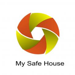
Design a symbol/emblem
- Titulaire du concours: MySafeHouse
- Categorie: Autre
- Statut: Terminé
Date de lancement: 29-05-2012
Date de clôture: 20-06-2012
Total budget: € 250.00
Dernière soumission
Tout a commencé par une idée...
Un guide court et interactif les a aidés à découvrir leur style de design et a parfaitement saisi ce dont ils avaient besoin.
Brandsupply est une plateforme où des professionnels créatifs et des entreprises collaborent sur des projets et des designs uniques.
Les clients à la recherche, par exemple, d’un nouveau logo ou d’une identité visuelle décrivent leurs besoins. Ensuite, les designers peuvent participer au projet via Brandsupply en soumettant une ou plusieurs propositions. Le client choisit finalement le design qu’il préfère.
Les coûts varient selon le type de projet — à partir de 169 € pour un nom d’entreprise ou de projet, jusqu’à 539 € pour un site internet complet. Le client décide lui-même du montant qu’il souhaite investir pour l’ensemble du projet.
Designer:
 charles_arvin
some feedback would be nice, thanks in advance :)
still waiting for some feedback :)
still waiting for some feedback :)
still waiting for some feedback :)
sorry, my browser sended three times. this was not intended..
Thanks for your design; i like a lot, my partners therefore need some time, they compare a to a medical sign. I like the S protecting the person. We are planning to expend the date further than today, 14 days longer. Of course you will here from me. Thanx again, gr. Raymond
Hoi, bedankt voor je inzending. Ik heb beoordelingen toegevoegd omdat vandaag de wedstrijd gaat sluiten. We zijn overeen gekomen met een andere designer, bedankt voor je inzendingen, succes verder!
MvrGr. Raymond
Ce concours est terminé. Il n'est plus possible de communiquer.
aucun commentaires
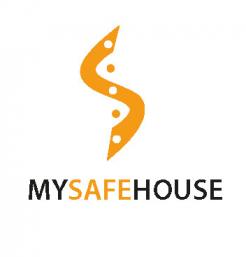
Hey Raymond, i made two diffrent versions. as you can see, the version beside my text has an other kind of s which looks more like a motion. hope you guys like it. i think in combination with the shield it makes a impression of safety. kind regards! charles
Ce concours est terminé. Il n'est plus possible de communiquer.
aucun commentaires
Ce concours est terminé. Il n'est plus possible de communiquer.
aucun commentaires
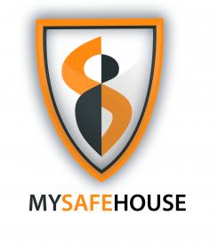
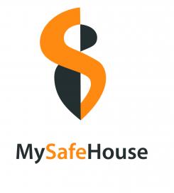
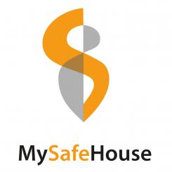
Hey Raymond, your definition of the symbol makes a lot of sense. so now i have taken the transparency out of the person, and the s is going around her, so it looks more like protection in my opinion. I can give the grey more brightness if you want. Hope you like it :) charles
Hey Raymond, your definition of the symbol makes a lot of sense. so now i have taken the transparency out of the person, and the s is going around her, so it looks more like protection in my opinion. I can give the grey more brightness if you want. Hope you like it :) charles
Hello Charles; Yes i like it much better like this. I'll definitely keep it in mind and wil discuss it with my partners. You will hear from mee, thanx again for now!
Gr. Raymond
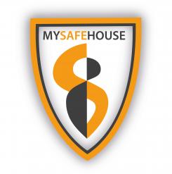
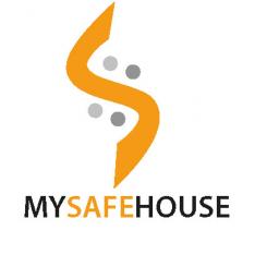
Hey Charles, i spoke to my partner and basicly we liked this symbol; do you think it is possible to put 'motion/movement' in it. We like the S protecting the person. Do you also think you could make like a shield around it, like you see in the army or whatever; it makes it stronger en we can also in the futuse complete it with a text around or above it. I hope to hear from you. Thanx. Raymond
Ce concours est terminé. Il n'est plus possible de communiquer.
aucun commentaires
Ce concours est terminé. Il n'est plus possible de communiquer.
aucun commentaires
Ce concours est terminé. Il n'est plus possible de communiquer.
aucun commentaires
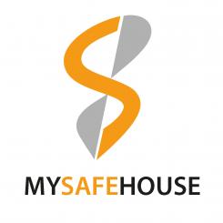
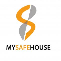
this logo is signifying a evil grey spirit and a proud s for safe, self-defense and selfconfidence.
Ce concours est terminé. Il n'est plus possible de communiquer.
aucun commentaires
Ce concours est terminé. Il n'est plus possible de communiquer.
aucun commentaires
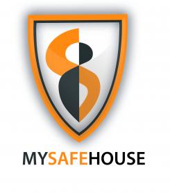
Hello, thank you for sending your symbols. This last one is very inspiring for me. The 'S' and the grey spirit/person wich represents 'my' in MySafeHouse. Of course i hope to recieve more symbols from other designers, but must say that i like yours.
Thanx, Raymond
Ce concours est terminé. Il n'est plus possible de communiquer.