 Nederland
 België
 Deutschland
 Österreich
 United Kingdom
 International
aucun commentaires
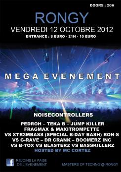
AFFICHE D'UN FESTIVAL TECHNO AVEC DE NOMBREUX DJ
Date de lancement: 06-06-2012
Date de clôture: 26-06-2012
Total budget: € 150.00
Dernière soumission
Tout a commencé par une idée...
Un guide court et interactif les a aidés à découvrir leur style de design et a parfaitement saisi ce dont ils avaient besoin.
Brandsupply est une plateforme où des professionnels créatifs et des entreprises collaborent sur des projets et des designs uniques.
Les clients à la recherche, par exemple, d’un nouveau logo ou d’une identité visuelle décrivent leurs besoins. Ensuite, les designers peuvent participer au projet via Brandsupply en soumettant une ou plusieurs propositions. Le client choisit finalement le design qu’il préfère.
Les coûts varient selon le type de projet — à partir de 169 € pour un nom d’entreprise ou de projet, jusqu’à 539 € pour un site internet complet. Le client décide lui-même du montant qu’il souhaite investir pour l’ensemble du projet.
Designer:
 msundji
Hello and thank you for that new proposal !
We will let the comittee of the organisation of the party decide and vote at the end of the contest !
Thank you !
Ce concours est terminé. Il n'est plus possible de communiquer.
aucun commentaires
Ce concours est terminé. Il n'est plus possible de communiquer.
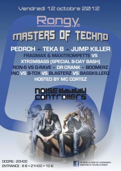
The first version
Privet, Hello and thank you for your samples.
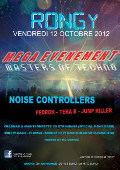
Honestly, that one is the one we prefer in your three posters. The background is very goo, well done. But all the general disposition of informations is still a bit unclear. They are too many things written on the same way ... And it does not get attention!
For "entrance", maybe use "<" and ">" signs as follow: "8 euros < 21H > 10 euros".
The most important DJ is "noisecontrollers", then "Pedroh - Teka B - Jumpkiller". But all the others are less important, they do not need to be writtent that big ! Same for "hosted by MC cortez" : it is not as important as the rest!
As said in first feedback, everything is written in a too linear way ... As a list !
But well done for improvement in background and colors effect. We like it.
Thanks again and see you soon !
Ce concours est terminé. Il n'est plus possible de communiquer.
One solution
Hello,
Thanks for that first sample. We like very much the contrast between the blue and the black ... but ... and it is quite paradoxical, we find the general effect a bit too dark ! Could you add more bright and color ? But keeping the horizontal picture (or not! but we like it!)?
Would it be possible to move down the "DOORS" information? We would prefer not having that kind of information at the top of the poster !
You seem to have skipped out the "MASTERS OF TECHNO" ! And it is the name of our party, so quite important! Maybe put it at the place of "MEGA EVENEMENT" if you can't put the two of them !
There are some imperfections in the text! For example, when you have two DJ in a batlle ... you have 1st name VS 2de name ! And we find better and clearer to have all on the same line ! The event is composed on different battles between lots of DJ ! And people should understand who is "fithing" against who clearly !
Thanks again!
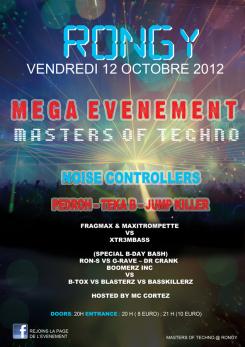
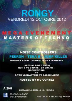
I listened to your suggestions and changed the things that are not good
Now I present to you two new versions of the posters
Ce concours est terminé. Il n'est plus possible de communiquer.