aucun commentaires
Tout a commencé par une idée...
Un guide court et interactif les a aidés à découvrir leur style de design et a parfaitement saisi ce dont ils avaient besoin.
Brandsupply est une plateforme où des professionnels créatifs et des entreprises collaborent sur des projets et des designs uniques.
Les clients à la recherche, par exemple, d’un nouveau logo ou d’une identité visuelle décrivent leurs besoins. Ensuite, les designers peuvent participer au projet via Brandsupply en soumettant une ou plusieurs propositions. Le client choisit finalement le design qu’il préfère.
Les coûts varient selon le type de projet — à partir de 169 € pour un nom d’entreprise ou de projet, jusqu’à 539 € pour un site internet complet. Le client décide lui-même du montant qu’il souhaite investir pour l’ensemble du projet.
les couleurs sont un peu vieillottes et ternes
Hello! Thank you very much for the comment!
I understand that you don’t like the logo in yellow color. I made this option because you required it, but and I agree that it looks a bit odd. The problem is that the background on the home page of your website is light (cyan) blue, and most of the colors won’t work well on this background. So if you’ve decided to go with blue background for your home page, I think that the best choice for the logo is to be white or maybe very dark blue color.
I’m looking forward to hear what you think and I’m open if you want to provide you more color options.
Regards,
Dari
Hello!
I didn't hear anything from you last some days. I know that the project is already closed, but feel free to contact me if you need any logo changes to be made.
It was a great pleasure to work on your project!
Regards,
Dari
Hello! Here are both required options.
I’m looking forward to hear what you think and if you want I’ll make more color options to choose from.
Regards,
Dari
Hello! thank you very much for the high rating!
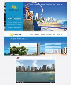
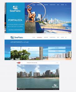
Here is the example of my logo, incorporated on your web design and you tube video. I'm open if you want to make any improvements.
Best regards,
Dari
We like your proposal. In the second image, on the page of the appartment with the white background, could you put "Seaflats" at the right of the image ? I think it would be better if the logo appears in lengh and not height (don't know if it's clear !)
Plus, one person would want to see this logo in yellow/orange too. Could you show us these two more versions ?
Hello!
Here are my new proposals for your logo.
Please, let me know what you like or don't like and I'll make revisions.
Looking forward for your next feedback!
Best!
Dari
Goedemiddag!
Hierbij mijn eerst voorstel voor uw logo. Ik sta open voor verandering c.q. wijzigingen, indien u dat wenst .
Met vriendelijke groeten,
Dari
Hello, we hope you understand English ! We like 70% of your logo, but the sun behind isn't modern for us. Could you redesign buildings and sun ? This part is too massive, we would like a clear and fresh logo.
We like the white version with the .com added.
Hello! Thank you very much for the comment!
Yes, of course, I understand English. I'm sorry that I wrote you in Dutch.. it is my mistake, it seems that I've made it automatically.
I'm glad to hear that you like my entry at all. Yes, I'll make redesign to my logo proposal and I'll submit my new layout tomorrow.
Thank you and have a nice evening!
Dari
 Nederland
 België
 Deutschland
 Österreich
 United Kingdom
 International
