aucun commentaires
FIRGUN RECORDINGS : LOGO POUR UN STUDIO D'ENREGISTREMENT ET DE REALISATION DE CLIPS VIDEO
Date de lancement: 13-04-2014
Date de clôture: 30-04-2014
Tout a commencé par une idée...
Un guide court et interactif les a aidés à découvrir leur style de design et a parfaitement saisi ce dont ils avaient besoin.
Brandsupply est une plateforme où des professionnels créatifs et des entreprises collaborent sur des projets et des designs uniques.
Les clients à la recherche, par exemple, d’un nouveau logo ou d’une identité visuelle décrivent leurs besoins. Ensuite, les designers peuvent participer au projet via Brandsupply en soumettant une ou plusieurs propositions. Le client choisit finalement le design qu’il préfère.
Les coûts varient selon le type de projet — à partir de 169 € pour un nom d’entreprise ou de projet, jusqu’à 539 € pour un site internet complet. Le client décide lui-même du montant qu’il souhaite investir pour l’ensemble du projet.
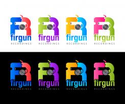
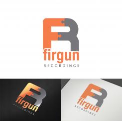
...and some more color versions (on a white and a black background)
Hello!
Thanks a lot for trying something else and with many colors. What you did is good but we prefer the first one.
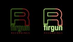
We had an idea that could be interesting. Keep the same design from your first logo but with an other idea to plug the F and R together: only draw the contour of the "R" with one color For the F and one for the R, and a "neon style" could be great! I hope you understand what i mean:) If not i can send you a picture but i am very bad!
Thanks for your feedback.
1) Do you want me to keep the puzzle-connection between the "F" and "R", or not? If you want me to keep the puzzle and use just "contour" and no fill, it doesn't look nice at all. You can send me the picture if you like, maybe I didn't understand your idea. However,
2)I find that the shortlisted (4 stars) design submitted by Budget Media is copy/pasting of my initial concept. As long as this copy issue is ignored in this contest, I am not going to submit any more designs to this contest.
What be liked in the Budjet Media logo wasen't the F+R , more the design of the Firgun Recordings, but don't worry we know the edea of the F plug to the R is from you ;) i ll try to send you a drwing of my edea
Can you give me your email adress? i will send you pictures to explain the concept!
My email adress is studiolyra@gmail.com. Looking forward to the pictures.
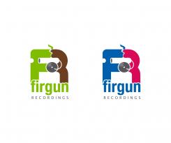
I am glad you like the logo. Here is another version (within the same F&R concept). The design in based on a cannon on wheels (in the negative space) being a record player at a same time. I changed the colors. How do you like this concept?
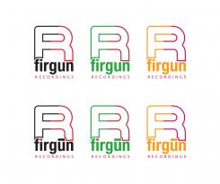
Here is my concept for your logo. The design is minimal, clean, simple and suitable for any (online and offline) medium. It is based on the letters "F" and "R" (of Firgun Recordings). The letters are puzzle connected in order to portray the meaning of the word "firgun", i.e. a contribution to someone else's pleasure/fortune.
Your feedback regarding overall design, fonts and colors is welcome.
ps
don't forget to enlarge the image to see the actual colors
The idea is interesting. Could you try with different colors ? We like the puzzle, but we would like to know if you could try to portray the meaning of the word with an other idea ?
The global design and fonts are great.
Thanks a lot
 Nederland
 België
 Deutschland
 Österreich
 United Kingdom
 International
