aucun commentaires
Logo d'un singe brandissant une banane avec fierté
- Titulaire du concours: Big Ben Junior
- Categorie: Logo
- Statut: Terminé
Date de lancement: 10-08-2015
Date de clôture: 31-08-2015
Tout a commencé par une idée...
Un guide court et interactif les a aidés à découvrir leur style de design et a parfaitement saisi ce dont ils avaient besoin.
Brandsupply est une plateforme où des professionnels créatifs et des entreprises collaborent sur des projets et des designs uniques.
Les clients à la recherche, par exemple, d’un nouveau logo ou d’une identité visuelle décrivent leurs besoins. Ensuite, les designers peuvent participer au projet via Brandsupply en soumettant une ou plusieurs propositions. Le client choisit finalement le design qu’il préfère.
Les coûts varient selon le type de projet — à partir de 169 € pour un nom d’entreprise ou de projet, jusqu’à 539 € pour un site internet complet. Le client décide lui-même du montant qu’il souhaite investir pour l’ensemble du projet.
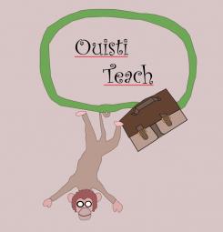
Unfortunately I prefere the previous monkey. This one is not common but he is quiet ugly :X and look quiet stupid too. Moreover his arm is very strange... You can do better :)
Yeah I know I can and I agree with you that this was a worse try .. I will give it another try later. :-)
aucun commentaires
Great, it is not a thug monkey anymore :) Unfortunately I have a new problem now. I find your monkey very cute, simple and happy but he lacks of charisma... he is too common. I would like a monkey for this brand which could be recognized between 100 others monkeys. Moreover, we have the feeling that your monkey is using the banana as a cellphone, I dont like this because it can create confusion. I invite you to work on these two remarks in order to raise your monkey to the next level, good luck !
aucun commentaires
Ok, I like it because your monkey is cute, simple and funny. However I have a problem because in small size, the monkey looks like a thief. Do you see what I mean ? It seems that your monkey wears a balaclava !! What a shame for a studious monkey. Can you fix that please ? Maybe only by removing the glasses... Thank you :)
Thanks for your comments again! I see what you mean and will work on that!
aucun commentaires
Thanks for these new versions ! I am gonna make comments on the last one as it is the one I prefere (he looks more simple and more funny !)
aucun commentaires
Ok, I really prefere this skin color, forget about the white please ;) It is a good work, your logo is original but I have a problem... it is too big and sophisticated. I need something smaller and more simple. Also, I am afraid that your logo could be seen as too childlike by 16-18 years old teenagers. Please keep in mind these recommendations for your futur proposals.
aucun commentaires
Hello, thank you for your work ! I like the simplicity of your logo but I am not really satisfied with your monkey. He seems very friendly but I dont find him cute enough and he lacks of charisma, he is too common. Also, I dont like the color layout. Blue and yellow are great but I dont like this color scheme combined with a brown-white monkey. I invite you to keep the idea of a monkey inside a blue cercle with the toga hat while drawing a totaly new monkey. Good luck !
Hi, thanks for the feedback and ratings! I will work on it and will show more as soon as possible.
 Nederland
 België
 Deutschland
 Österreich
 United Kingdom
 International


