aucun commentaires
Cryobar le nouveau concept de cryothérapie corps entier cherche un logo
Date de lancement: 15-01-2017
Date de clôture: 22-01-2017
Tout a commencé par une idée...
Un guide court et interactif les a aidés à découvrir leur style de design et a parfaitement saisi ce dont ils avaient besoin.
Brandsupply est une plateforme où des professionnels créatifs et des entreprises collaborent sur des projets et des designs uniques.
Les clients à la recherche, par exemple, d’un nouveau logo ou d’une identité visuelle décrivent leurs besoins. Ensuite, les designers peuvent participer au projet via Brandsupply en soumettant une ou plusieurs propositions. Le client choisit finalement le design qu’il préfère.
Les coûts varient selon le type de projet — à partir de 169 € pour un nom d’entreprise ou de projet, jusqu’à 539 € pour un site internet complet. Le client décide lui-même du montant qu’il souhaite investir pour l’ensemble du projet.
Hi,
Good Morning!
Here is the updated design as per your suggestion.
Also have provided few minor variations in the lettering.
Let me know which number you prefer.
Kind Regards,
Rusty
Hello Avital,
Did you check the design?
Was Waiting for your response!
If you have decided to go with some other design,
Please let me know, so I can use the design for other projects,
Do reply
Kind Regards,
Rusty
Dear Rusty, I wasn't online since friday.
I really like your new logo, something is missing, how can we continu if your quota is over?
I would try a red snowflak with a white halo around.
thank you
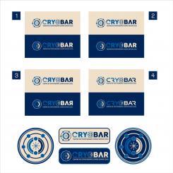
Hi, let me know your preference amongst the 4 logo here
So can update it n send u preview
aucun commentaires
Hi,
Here is the updated font style in caps.
Have made the snow flake Ral1013 on blue bg RAL 5013.
Have removed the dot/sphere from the "C".
This is my entry no. 14. Can upload only one more.
Theirs a limit of 15 uploads per designer.
Awaiting your response,
Kind Regards,
Rusty
i think we are in the correct direction ... I would use the draw smaller instead of the O in the name and I will modify the C which isn't relly nice. keeping the ral 1013 in background. for any changes we could continue by mail if possible what do you think?
Draw smaller, I am not understanding.
Are you talking about the icon or the O in the name cryobar.
C needs To be changed, but it has to follow the font style of the name. So the font style needs to change.
Do you prefer rounded fonts or sporty or squarish type.
Lastly, their are few Design s where you haven't commented, just remove the star rating s from those designs and I will delete those designs. It will free me 2-3 upload space.
Can work through email once their is no upload space.
I really don't know how to remove stars... I tried but no succes
1. I want to include the draw in the name by removing the letter O and replace it by the draw reduced at the same size as the other letter.
2. The C letter looks unfinished, Another graphist has include an arrow cut like part of a watch. It was a good idea but it needed to be deepen (http://www.brandsupply.fr/design_logo/cryobar-le-nouveau-concept-de-cryotherapie-corps-entier-cherche-un-logo/101974/design/689619)
YOu also removed the underline but you can replace it because it was nice (http://www.brandsupply.fr/design_logo/cryobar-le-nouveau-concept-de-cryotherapie-corps-entier-cherche-un-logo/101974/design/690523)
Ya, I removed the underline because when the lettering of name was small the "y" was disturbing the sentence under it. So I cut the tail of y and to balance it introduce the line. Shall place it back.
Yes, I remember that design with arrow for c. Shall update my design accordingly and present the updated version in morning.
In meantime if you have any other concerns, suggestions please do tell. Shall update the design and present them in morning.
Will also remove the O from name and replace it with logo icon
At this time you are only 2 in competition
We can work by mail to finish the work, my address is simple. i n f o a t the name of the company .fr
Sure,
Will mail you when it is needed.
It's 4;30am now here.
Shall update and upload the design in morning. And if further changes are needed shall mail you.
I am using smart phone for typing, it is really time consuming process. I really hate typing on these phones.
C u after couple of hours.
aucun commentaires
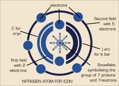
iCON DESIGN WITH DESCRIPTION FOR YOUR VISUALISATION
I like this one we need to test different font. (maybe in capital letter)
aucun commentaires
Hi,
Good Evening!
Here is the design I have been working on.
The Nitrogen atom structure as icon.
The nitrogen atom has 2 energy fields of electrons revolving around the protons and neutrons.
The first field contains 2 electrons and the second field with 5 electrons (total of 7 electrons).
At the center snow flake ( symbolising 7protons and 7neutrons).
Also in the icon have used the arcs to form the part shape of C (Cryo) and part shape arc ) for b (bar). The first field passes through the "cb" containing 2 elctorns
Awaiting your response,
Kind Regards,
Rusty
the circle inside the letter C isn't necessary I would try a Ral1013 on the snowflake with blu background, and different font
Shall update the design with font and colors as per your suggestions.
Please if possible remove the ratings from the designs where you have not mentioned any comments, so i can delete them. The total number of submissions that can be made are limited to 15. If you shall remove the ratings from the designs where you have not mention any comments I can delete them and gain some space so can make the changes and present/upload the design for your visualisation.
aucun commentaires
Hi Avital,
Good Morning!
Here is the updated design with the colors as per your requirement.
RAL 1013 - CMYK value 5, 10, 20, 0 and hex value #e3d9c6
RAL 5013 - CMYK value 100, 80, 10, 50 and hex value ##193153
Kind Regards,
Rusty
very nice...
aucun commentaires
lots of work... impressive. Can you try with a RAL1013 background
Sure, shall present the updated design soon.
Had two more concepts in mind.
1) how about using the nitrogen atom structure as the icon.
2) one of the concepts shall need to break the name stacked upon one another
Crying
Bar
Is it ok?
nitrogen atom structure as the icon as been tryed by other graphist with no impressive result. Of course you are free to make a test. Regarding the name I prefer to keep the name together
thx
Extremely sorry, I didn't notice the typo.
My sincere apologies.
Shall present the updated design with Ral1013 background soon.
aucun commentaires
Simple, elegant, proper, nice....it needs just a bit of flow, energy
Will work on the design and present updated version soon.
aucun commentaires
Hi Avital,
Here is my new design for you.
Have created the icon with the help of negative space method. Have kept it simple and strong. Have designed it considering it's use on machines as well as other digital and print purposes.
Awaiting your response,
Rusty
aucun commentaires
Hello Avital,
Here is a new icon for the logo .
Awaiting your response,
Kind Regards,
Rusty
weel done with the draw but unfortunatly too complicate to understand.
You did respect the colour but the draw is too lounge and the name is too . I need more energy
Shall work on the designs and present simple strong Design tomorrow.
aucun commentaires
Hi Avital,
Here is the updated design.
Awaiting your response,
Kind Regards,
Rusty
Hi Rusty,
This is too similar with the first logo
Ya I just updated the colours in this one
aucun commentaires
Signalisation murale et présentation imprimée pour votre design.
The idea is really good !
You have understood the purpose of the therapy which is : to chill from the inside naturally"
You can deepen the subject ... using the color indicate in the description, ect...
Hi,
By deepen you mean, using more dark color right?
Yes but also by declining the logo, because I am not necessarily convinced of the spheres. But you have clearly identified the subject and my request.
Very Well!
I shall update the designs.
and present them for your visualization.
Regards,
Rusty
aucun commentaires
Hello Avital,
Good Afternoon!
Sorry for the late response!
Here is my design proposal for you.
Let me know if you need any other color variation for your design.
Awaiting your response,
Kind Regards,
Rusty
you can deepen the logo it is nice
 Nederland
 België
 Deutschland
 Österreich
 United Kingdom
 International
