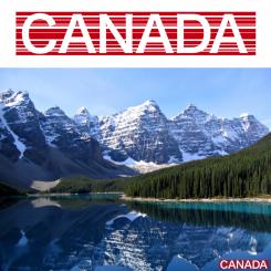
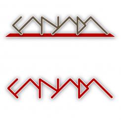
Logo for the detsination CANADA
Détails du concours:
Pack bronze
- Titulaire du concours: alexabeckord
- Categorie: Logo
- Total budget: € 199.00
- Date de lancement : 28-11-2012 13:53
- Date de clôture : 16-12-2012 13:50
- Statut : Terminé
- Formats requis: jpg,ai
- Fichiers pertinents: Aucun
-
Langues disponibles:

- Nombre de designs: 158
-
Taux d'implication du client:
faible élevée
Besoins:
In the logo, CANADA should stand out.
The logo should be cool & pure, to show what Canada is about and make it a younger brand.
Description de l'entreprise:
Canada Marketing Committee - an organization that has the goal to promote Canada in the Netherlands.
La cible:
Canada lovers and those still need to be convinced that Canada is a great travel destination.
Couleurs, favoris et autres exigences:
Colours (only suggestions): red, dark green, khaki
Possible to include: moose, Canada flag (or colours of it), maple leaf
Languima
-
-
Description du designer Languima:
The thickness of the lines can be changed.
White space between the lines is transparent. -
Ce concours est terminé. Il n'est plus possible de communiquer.
-
-
-
Description du designer Languima:
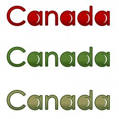
Custom made letters
-
Ce concours est terminé. Il n'est plus possible de communiquer.
-
-
-
Description du designer Languima:
If you perhaps would like to see any variations in colour or stroke, I'll be happy to hear from you.
Kind regards -
Ce concours est terminé. Il n'est plus possible de communiquer.
-
-
-
aucun commentaires
-
Ce concours est terminé. Il n'est plus possible de communiquer.
-
-
-
aucun commentaires
-
Ce concours est terminé. Il n'est plus possible de communiquer.
-
-
-
Description du designer Languima:
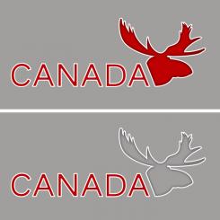
... or with another type of moose head...
-
Ce concours est terminé. Il n'est plus possible de communiquer.
-
-
-
Description du designer Languima:
Here's something totally different.
I believe that this abstract approach supports your need for a cool & pure logo.
Variations in shape, colour and outline/shadow are possible, with or without the 'ground' the logo stands on in the first variation.
I'd like to hear your thoughts about this logo!
Kind regards. -
Ce concours est terminé. Il n'est plus possible de communiquer.
-
-
-
Description du designer Languima:
Hi,
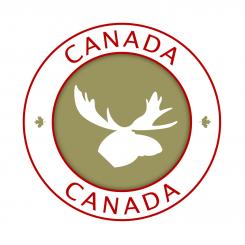
as you can see I made some adjustments: I replaced the maple leaf by a (abstract) moose and changed the colour of the inner circle into khaki. I also added some depth to that inner circle.
These changes leed to a more dynamic design in my opinion.
The word 'destination' was replaced by 'canada'.
I hope these changes meet up to your expectations.
If you want me to do some other alternations, I'll be happy to hear from you.
Kind regards. -
Ce concours est terminé. Il n'est plus possible de communiquer.
-
-
-
Description du designer Languima:
The circle symbolises the endless possibilities to travel in Canada.
The color red and maple leaf speak for themselves. Even without the text, people will know that this logo represents Canada.
Looking forward to your feedback... -
alexabeckord dit :
Thanks, it's a good start. The logo does not necessarily need to include the word destination, but it would be OK as well.
Any variations possible here? May be also in colour?
Thanks! -
Ce concours est terminé. Il n'est plus possible de communiquer.
-

