Logo and Design for Catering Company
Détails du concours:
Pack or
- Titulaire du concours: mvirmond
- Categorie: Logo et Identité
- Total budget: € 449.00
- Date de lancement : 02-10-2012 18:08
- Date de clôture : 12-10-2012 17:55
- Statut : Terminé
- Formats requis: jpg,psd,für Visitenkarten, Broschüren und Guidelines sind möglich: Word, Pages, PDF, Powerpoint oder Keynote
- Fichiers pertinents: Aucun
-
Langues disponibles:


- Nombre de designs: 221
-
Taux d'implication du client:
faible élevée
Besoins:
Specifically, final submissions should include:
- Logo
- Color scheme (e.g. for our website)
- Brief guidelines für using logo, colors and fonts
- Template for business cards
- Template for brochures
You may initially submit just the logo. We will provide feedback on a regular basis. If we like the logo (4-5 stars) you can submit the remaining elements later (however, please submit them BEFORE the competition finishes).
Description de l'entreprise:
We are offering catering for companies/offices in central Switzerland (esp. Kanton Zug).
In particular, we offer lunch options (initially salads, sandwiches, juices, desserts), at a later stage potentially expanding into other product groups and services/delivery times. All orders are placed online.
We aim to position ourselves with high quality, fresh, tasty, healthy/light products, at a very affordable price.
Additional brand attributes include: regional (central Switzerland), innovative, reliable, clean/hygienic.
Our brand name includes "essen" (German for food), "essence" as well as "sense"/"senses".
La cible:
Our target customers are business people/office workers in central Switzerland, i.e. above average income, appreciative of quality, international mix.
We aim to target in particular those customers who are looking for high quality, healthy food.
Couleurs, favoris et autres exigences:
There are no restrictions for the logo design, we are open to all suggestions.
If the logo does not contain the brand name "essense" (capital letter spelling still tbd) in writing, your suggestion should also include a graphic design for the actual brand name.
The color scheme should include a suggestion which colors (RGB codes or similar) to use for background, highlighting, buttons, writing etc.
Guidelines should outline in a few bullet points how to use logo and color scheme (e.g. which background colors can the logo be placed on), as well as a suggestion for one (or more) font types (ideally standard fonts), and potentially other suggestions (at your discretion).
The brochure template will be used primarily for a summary of our offering and the company, presumably in a simple A4-portait-format - so this is not a flyer or anything fancy. Just simple application of the above logo and design (same for business card)
velosipedica
-
-
Description du designer velosipedica:
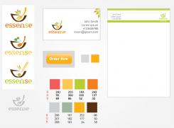
hope you like it
-
Ce concours est terminé. Il n'est plus possible de communiquer.
-
-
-
Description du designer velosipedica:
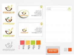
it looks good with white background.
-
velosipedica dit
Do you like it?
-
Ce concours est terminé. Il n'est plus possible de communiquer.
-
-
-
Description du designer velosipedica:
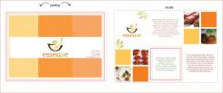
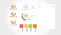
for brochure
-
Ce concours est terminé. Il n'est plus possible de communiquer.
-
-
-
Description du designer velosipedica:
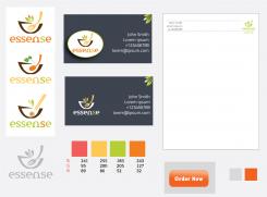
i made some changes. feedbacks are helpful. I want it to look professional, but also to keep fresh and healthy look. i also pick two colors that could be used for a website.
-
mvirmond dit :
nice! i like it.
what do you thing about a white background for the business card? -
Ce concours est terminé. Il n'est plus possible de communiquer.
-
-
-
Description du designer velosipedica:
I hope You like it.
-
mvirmond dit :
i like the colors. although they all have a similar intensity. for designing a website, I would think I also need some lighter colors for backgrounds etc. as well as some strong, contrasting colors for highlighting, "order now"-buttons etc.
As much as I like the font you used for the brand name, I just don't like the font you chose for the business card and letter head. I guess I'm looking for something more serious and professional (while retaining the young and fresh appeal you so nicely integrated with the logo).
Similarly, I think the logo for the business card is just too big. and I'm not sure I understand the 4 dots next to the logo. hope that helps... -
Ce concours est terminé. Il n'est plus possible de communiquer.
-
-
-
Description du designer velosipedica:
very good brief, indeed. your feedbacks are very helpful.
-
mvirmond dit :
nice style
-
mvirmond dit :
one of my favorites overall. Nice, fresh, fun. maybe an additional variation with chopsticks even (for later)?
I would suggest you expand the design to cover all elements of the submission (color cord, templates etc.), as I clearly see this as part of the final selection of designs. Happy to look at new variations in the meantime if you still have new ideas, but keep in mind the contest ends soon. -
Ce concours est terminé. Il n'est plus possible de communiquer.
-
-
-
Description du designer velosipedica:
I have to say that I'm delighted with the wordplay. This is my solution for yor contest. I hope this idea will fit your business. If you have any suggestions or additional ideas, please let me know. Lena
-
mvirmond dit :
nice idea. love the young, fresh design. looks more like a soup though (with the spoon) - which will be an interesting addon. But for now, a fork would be better. maybe you could use variations?
-
Ce concours est terminé. Il n'est plus possible de communiquer.
-

