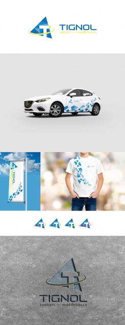
The very first one with triangles inside.
Logo: donner une image forte, moderne et dynamique pour une entreprise de négoce de matériaux et vente de béton prêt à l'emploi
- Titulaire du concours: Tignol Béton
- Categorie: Logo
- Statut: Terminé
- Fichiers: Fichier 2
Date de lancement: 24-05-2017
Date de clôture: 07-06-2017
Tout a commencé par une idée...
Un guide court et interactif les a aidés à découvrir leur style de design et a parfaitement saisi ce dont ils avaient besoin.
Brandsupply est une plateforme où des professionnels créatifs et des entreprises collaborent sur des projets et des designs uniques.
Les clients à la recherche, par exemple, d’un nouveau logo ou d’une identité visuelle décrivent leurs besoins. Ensuite, les designers peuvent participer au projet via Brandsupply en soumettant une ou plusieurs propositions. Le client choisit finalement le design qu’il préfère.
Les coûts varient selon le type de projet — à partir de 169 € pour un nom d’entreprise ou de projet, jusqu’à 539 € pour un site internet complet. Le client décide lui-même du montant qu’il souhaite investir pour l’ensemble du projet.
I like the graphics effect on the car and on the t-shirt.
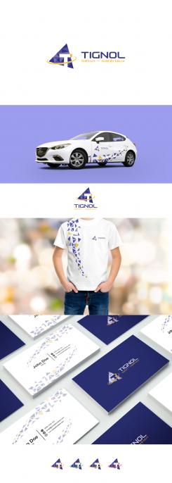
Could you add a little bit of yellow in the graphics ? Not as much as blue, just little ?
Of course, thank you!
Version with more regular triangles and colour fitting.
Hope you like it more.
All the best,
m3kdesign.
Adjustment with colours you need
very first design edited.
On my computer, these colors appears lighter than the ones I asked for.
Blue should be like the blue of our former logo and yellow should be pantone 109C, is this what you did on this logo?
It's always difficult between the colors on the screen and on the paper
On my computer, these colors appears lighter than the ones I asked for.
Blue should be like the blue of our former logo and yellow should be pantone 109C, is this what you did on this logo?
It's always difficult between the colors on the screen and on the paper
On my computer, these colors appears lighter than the ones I asked for.
Blue should be like the blue of our former logo and yellow should be pantone 109C, is this what you did on this logo?
It's always difficult between the colors on the screen and on the paper
ooops 2 time too much :) the website wasn't refreshing the page, I sent it again
More simple variation of logo before
This one I don't like very much the texure
Here are refined version with more fresh colour but in the same design concept
I like this texture thing even if it may not be the case of everybody in the company, but it's good to have this version to show
Could you apply this texture and this blue color to the very first logo you did please ?
Could you also make the very first logo but using the blue we have on our current logo ?
Concerning the yellow I would like it pantone 109 C or the same, RAL 1018. I would like also an option with the yellow of our current logo.
Thanks a lot by advance for all this work
Fabien
The version without 3D effect with "fresh" yellow.
Here is the version with "fresh" yellow.
Hope you like it more.
Kind regards,
m3kdesign
Here is the second option as you needed.
Hope you like it update with a little 3D effect.
Creative regards,
m3kdesign
I like the 3 effect, but it's a bit too much information, could you try this without the 3D ?
Thanks again
Fabien
*3D , and I forgot to say "please" :)
Regards
Fabien
Dear Tignol,
first at all thank you for rating and constructive and professional feedback.
Here is first option you needed, with yellow details.
Hope you like it more.
All the best,
m3kdesign
Thank for the new one, can we try this one with a yellow a bit brither, I would like it to look a bit more fresh :)
Regards,
Fabien
Dear Fabian,
here is my vision about your company.
If you have some suggestions, please feel free to contact me.
Hope you like it.
Kind regards,
m3kdesign.wix.com/portfolio
Hello,
Thanks for your work, I like it.
Could you please make 2 differents options:
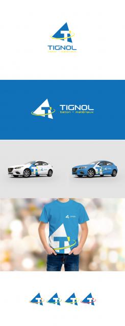
1/ same logo but all the mockups made with yellow part insted of green
2/Trying to keep the triangle with flat basis to bring more "stability" to the logo. Doing this I imagine it will get less dynamic which I don't want, but I would like you to try this version
Thanks you by advance !
Regards
 Nederland
 België
 Deutschland
 Österreich
 United Kingdom
 International
