Hi Jeff,
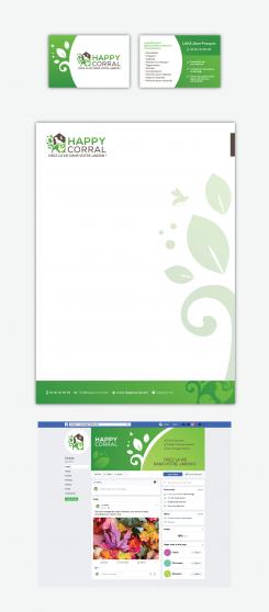
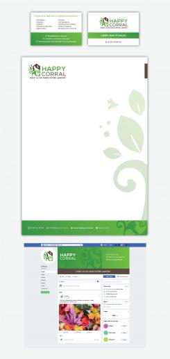
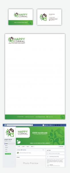
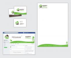
Here is the revised stationery design from this morning. I just changed the business card a bit, because after applying your texts/details, the previous design wasn't work anymore.
In this stationery I've used the logo with a bee at the top of the leafs. If you prefer the other logo with the bee in front of chicken, I'll apply it as well.
Looking forward to hear what you think.
Regards,
Dari
Creation d’un logo et autres supports visuels pour entreprise fabricant des habitats pour animaux
- Titulaire du concours: Jeff67
- Categorie: Logo et Identité
- Statut: Terminé
Date de lancement: 14-03-2019
Date de clôture: 14-04-2019
Tout a commencé par une idée...
Un guide court et interactif les a aidés à découvrir leur style de design et a parfaitement saisi ce dont ils avaient besoin.
Brandsupply est une plateforme où des professionnels créatifs et des entreprises collaborent sur des projets et des designs uniques.
Les clients à la recherche, par exemple, d’un nouveau logo ou d’une identité visuelle décrivent leurs besoins. Ensuite, les designers peuvent participer au projet via Brandsupply en soumettant une ou plusieurs propositions. Le client choisit finalement le design qu’il préfère.
Les coûts varient selon le type de projet — à partir de 169 € pour un nom d’entreprise ou de projet, jusqu’à 539 € pour un site internet complet. Le client décide lui-même du montant qu’il souhaite investir pour l’ensemble du projet.
Hello. Could you send me here the previous business cards just for see please ?
Maybe I will change the text in order to make it worked.
Hello. Could you send me here the previous business cards just for see please ?
Maybe I will change the text in order to make it worked.
Hi Jeff,
Thanks for the comment and rating!
I've reached up the maximum of entries in this project (15) and I can't upload designs anymore..
But you can see and download the previous business cards from this dropbox link: https://www.dropbox.com/s/0kyp5x0ilk2vz2v/Happy Corral15.jpg?dl=0
If you need any other improvements, I'll just provide you links where you'll be able to see the revisions.. I'm sorry for the inconvenience, but Bransupply has created this limit of designs.
Looking forward to hear from you.
Regards,
Dari
you can erase the design there when I put 0 star
See old ones please
Best regards :)
Jeff
Hello Jeff,
Unfortunately, I can't remove them..
If you need any revisions, I'll send the designs via dropbox.. there is no other way.
Best regards,
Dari
Hi Jeff,
Here is another variation of the business card, based on my proposal from yesterday morning.
You can see the design here: https://www.dropbox.com/s/prvad3prb7o91tt/Happy Corral18.jpg?dl=0
Looking forward to hear from you.
Regards,
Dari
Hello Darina, I leave you a message in your box.
Hello Jeff,
Thanks for the comments!
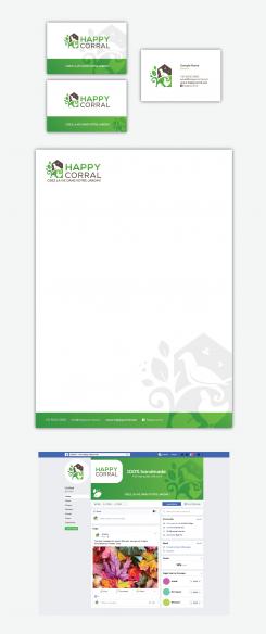
Here is the stationery set with the requested texts / details applied.
Everything could be changed, so please don't hesitate to ask me for revisions.
Best regards,
Dari
Hello, I was prefering the style of the one of this morning lol !
visite Card, head paper, etc, the style was so cool this morning lol
.
All ok ! I will just ask my wife if she likes too lol.
.
Hello Darina. Can you make a little more design in all of it please ? A little bit like "Bartous " ?
Hello Jeff,
Here is my revised logo option with some different bee’s style. I also made the stationery set. Please, let me know what you like or don’t like on the logo and stationery and I’ll make improvements.
Also, if you want you can provide me your actual details for the business card and letterhead (address, phone numbers, e-mail etc.. or any other information you may want to be included) and I’ll apply them.
Do you have any specific requirements about the texts or information you want to show on the facebook cover? If you have, please let me know. You don’t need to have too much texts on the cover, because no one will read it.. Most important is to take the visitor’s attention with some very short but concrete info about your business / services and the visual photo or background.
Please, let me know what your thoughts are and I’m open if you need to make any improvements.
Looking forward for your next feedback.
Best regards,
Dari
Hello, yes I will give you all the infos.
Take back the butterfly.
Keep a bee on the left side up of the plant OR in front of the chiken ?
Thank you
Good morning, Jeff!
I've created another variation of the logo with different bee's treatment.
Let's see if this option is better than the previous one.
Best regards,
Dari
Hello Darina,
No sorry this is not the right bee.
Hello Jeff,
Here is the revised logo. I replaced the butterfly with a bee. In my opinion it looks good too. My only concern is that if the logo is scaled to smaller size, maybe the bee won't be enough visible. Maybe you can try to print the logo and see how it is looking actually.
I'm open if you need to make any other tweaks.
Regards,
Dari
This bee is to much cartoon one lol
And yes, not enough visible, you are right !
Hello Jeff,
Thanks for the high rating!
Here is the stationery set with the applied last version of the logo.
Please, let me know what you think about the business cards, letterhead and facebook cover and don't hesitate to ask me for revisions.
Best regards,
Dari
Hello Darina,
Thank you very much.
Let me think about all of that, but you are in the 3 better.
If I see somehting to change I will come back to you as soon as possible.
Best regards
Jeff
Hello Jeff!
Thanks for the comment!
Of course, take your time to review and think about the designs and which one would works best for you and your business.
Regards,
Dari
Hello again
Just for see difference, could you make a bee at the place of the butterfly please ?
Just on one logo test.
Hello Jeff,
Here is my revised logo without eyes on animals and another chicken design. Please let me know what you think. I'm open if you think that I can make any other improvements.
Looking forward to her your next feedback.
Regards,
Dari
Hello Jeff,
Here is my revised logo proposal. I replaced the animals a bit and also added a butterfly.. Let me know if this is on the right direction.
I'm open if you need to make any improvements.
Best regards,
Dari
Nice ! Really better !
I have to think about. Maturing this logo in my head.
Best regards. Jeff
Ah yeah a right direcion. But I some little points of modifications :
1 - No eyes on animals please.
2 - A better chicken design ?
Must read : Ah yeah on the right direction*
Sorry
Thanks for the comments, Jeff! I'll improve the chicken and remove the eyes and send you my new proposal.
Thanks!
Dari
Hello Jeff,
Here is my revised logo design.
I made the requested changes:
1. I added a space before ‘!’
2. I applied the same font style to the tagline, as in my first design.
3. I included into the logo a chicken and hedgehog.
Please, let me know what you think for this logo option and don’t hesitate to ask me for more revisions.
Looking forward for your next feedback.
Best regards!
Dari
Hello,
Thank ou very much for this test.
1 - The chicken is too much or in a wrong place...
2 - Revision potential : thinking about added more animals but with a différent places ????
I don't know it is just an idea.
Best regards
Jeff
Hello Jeff!
Thank you very much for the comments!
Here is my revised logo and stationery designs. I'm open if you need to make any other improvements.
Looking forward to hear your next feedback.
Best regards!
Dari
Hello Darina,
Yes very nice.
1 - For "Osez la vie dans votre jardin !" Make a space between the word "jardin" and the "!" please.
2 - Again for ONLY the sentense "Osez la vie dans votre jardin" use the font of your first proposal please.
3 - Could you make a little test with including other animals with the dove please ? Like a chicken, an hedgehog ?
Have a nice evening
Jeff
Hello Jeff,
Here is my proposals for your business card, letterhead and Facebook banner. Please, let me know if you want to include any other specific information on the banner, such as texts, photos etc.
Looking forward to hear what you think.
Regards,
Dari
Regarding bottom of business cards, letterhead and banner, I would like you to take the green section of your first proposal (filigree aspect on the right)
Hello Jeff!
Thank you very much for the comment and high rating!
I’m really glad to hear that you liked my logo concept.
Here are 4 new logo options with some different font styles. I also switched the colors of the logo and text.. Let me know what you think and which of the combinations you like most.
I’m open you need to provide you more font and color options to choose from.
All your comments are welcome!
Have a nice weekend!
Best regards,
Dari
Thank you Darina!
1.Regarding font, I like the one from "Kolem" ; just check and apply it to all the text.
2.Please try to put a variation/gradient of greens in both logo and text.
3.Regarding the alternance of green and brown, I prefer number 1 or 2 with brown roof and brown "Corral".
Hello! Here is my first proposal for your logo. Please, let me know what you think and if I'm on the right direction. I'm open to make revisions or new options.
Regards,
Dari
Hello, thank you very much !
The subject means to be not so easy but you have it ! You are in the good way !
1 - Your logo is very nice : a touch of nature, a touch of life and animals, and a touch of a construction ! I like it !
2 - The police type of the name is maybe perfectible ?
3 - Switch colors for see if it's better ?
Best regards
Jeff
 Nederland
 België
 Deutschland
 Österreich
 United Kingdom
 International
