aucun commentaires
DigitalMouse
- Titulaire du concours: mcabaraux
- Categorie: Logo et Identité
- Statut: Terminé
Date de lancement: 18-12-2012
Date de clôture: 18-01-2013
Tout a commencé par une idée...
Un guide court et interactif les a aidés à découvrir leur style de design et a parfaitement saisi ce dont ils avaient besoin.
Brandsupply est une plateforme où des professionnels créatifs et des entreprises collaborent sur des projets et des designs uniques.
Les clients à la recherche, par exemple, d’un nouveau logo ou d’une identité visuelle décrivent leurs besoins. Ensuite, les designers peuvent participer au projet via Brandsupply en soumettant une ou plusieurs propositions. Le client choisit finalement le design qu’il préfère.
Les coûts varient selon le type de projet — à partir de 169 € pour un nom d’entreprise ou de projet, jusqu’à 539 € pour un site internet complet. Le client décide lui-même du montant qu’il souhaite investir pour l’ensemble du projet.
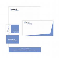
Ok, no problem. I did it. What do you say now?
Hi,
Ok thanks this is good now.
BRs,
Michaël
aucun commentaires
Hi,
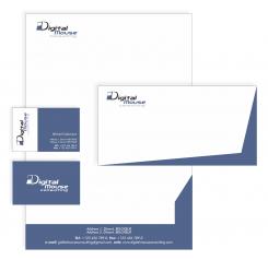
Ok blue is ok now ...
Could please put back the little "cubes" under the D of digital mouse ? And keep this blue then ?
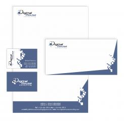
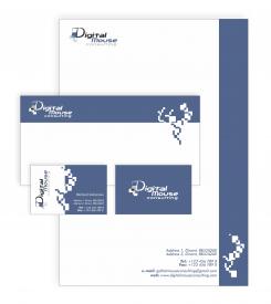
Little something extra for document template could you please keep the footer only with the blue and remove the blue on right side ?
Best Regards,
Michaël
aucun commentaires
Hi,
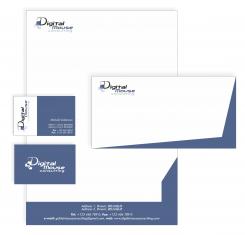
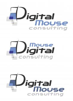
Sorry to come back on this again. But we think that another blue would be better. In the three first logo you have made we would like you to use the "blue" of the first logo (the top one of the three).
The rest is ok like that.
Best Regards,
Michaël
It's ok, don't apologise! Now I'm sending the newest solution. :)
aucun commentaires
Ok, I'm sorry, I didn't realised at first what you were talking about.
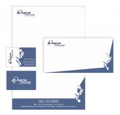
White blocks which I removed was something that reminds me a bit on some "digital things", and gray blocks which you can see on logo symbolise mouse clicking. Would you like me to keep it on logo or I should remove it also?
aucun commentaires
Hello,
Looks nice ...
But as mentionned before the drawing (white blocks) looks a bit too much. We don't really know what they represent. Would it be possible to remove it and to keep the last colour scheme ?
BRs,
Michaël
aucun commentaires
Hi,
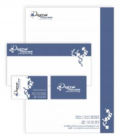
The logo is nice but I have small issue with the templates (business cards, ...). The drawing on the side is a bit strange.
Best Regards,
Michaël
Hello!
Do you think about the back side of the business card? If you are, that is ok. If I use logo on a blue surface, colours of the logo should be a bit different. If you would like, I can fix it and made logo in negative on the other side of the business card and on the envelopes also.
You can also tell me, what hue of the blue I should use, lighter or darker blue? Which one do you prefer?
I would say back side in negative yes. For the blue the darker one.
Brs,
Michaël
Hello again!
I made some corrections on my negative logo. Hope you will like it.
 Nederland
 België
 Deutschland
 Österreich
 United Kingdom
 International
