aucun commentaires
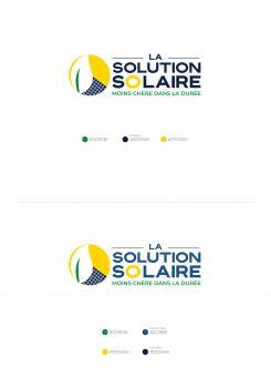
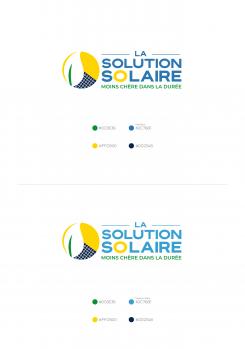
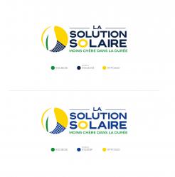
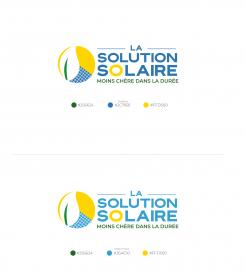
LA SOLUTION SOLAIRE Logo et identite
- Titulaire du concours: aaidara
- Categorie: Logo et Identité
- Statut: Terminé
Date de lancement: 24-10-2020
Date de clôture: 07-11-2020
Tout a commencé par une idée...
Un guide court et interactif les a aidés à découvrir leur style de design et a parfaitement saisi ce dont ils avaient besoin.
Brandsupply est une plateforme où des professionnels créatifs et des entreprises collaborent sur des projets et des designs uniques.
Les clients à la recherche, par exemple, d’un nouveau logo ou d’une identité visuelle décrivent leurs besoins. Ensuite, les designers peuvent participer au projet via Brandsupply en soumettant une ou plusieurs propositions. Le client choisit finalement le design qu’il préfère.
Les coûts varient selon le type de projet — à partir de 169 € pour un nom d’entreprise ou de projet, jusqu’à 539 € pour un site internet complet. Le client décide lui-même du montant qu’il souhaite investir pour l’ensemble du projet.
:)
that' perfect! Thank you Man!
that' perfect! Thank you Man!
aucun commentaires
Yes! Perfect. This is good now.
Thank so much for beeing reactive and professional.
aucun commentaires
please keep "LA SOLUTION SOLAIRE" as it was before
The blue is just on the icon
Yes! Perfect. This is good now.
Thank so much for beeing reactive and professional.
Finally we are going to keep this version as the best version
wow !great, thank you so much :)
one slite update: on the icone, at top of the leave, there is a white space, can you close that white gap with a thin yellow sun color
one slite update: on the icone, at top of the leave, there is a white space, can you close that white gap with a thin yellow sun color
at the botom no changes
aucun commentaires
This is nice.
One last request please:
The first blue squares at the top do not have the same size as the other squares in the middle. Can you delete them (the first row of blue squares)
Also, can use the green used on the leaf, on the sloagn (green on the slogan is too dark).
a slite more dark blu on solar panel, as solar panel are darker (https://images.app.goo.gl/VWLyd4ANhRTuvHwh9)
aucun commentaires
Hi. Hope the proposal finds well :)
Greetings
Mehru
Hello.
Thx for quick update.
For the stripe on the blue, we want vertical and horizontal ligne so can look like a solar panel look
vertical and horizontal lines must match the shape of the sphere
ok great !
In this proposal the lines which I given its not proper way, I am sorry. your comments helped me!!. the shapes blues and yellow is little bit curved as wave, according to that I made the lines vertical & horizontal"
Thank you
aucun commentaires
this fine and beautifull. Thank for your work and speed feedback. I will submit this for review to my colleague. And is probably 1 last request coming. I will update in 2 or 3h max.
Thanks :)
Sincerely
Mehru
Hello,
I have one last update, but we will simple if can explain it a zoom session.
Please join me here: https://us04web.zoom.us/j/79118243917?pwd=TzZ0ckJRNlhoeVJTcFJGN1Q5QXBDdz09
Let me try to resume what we need as a last update:
It's all on icon. The rest is fine and good.
Look at the very first icon you propose, the position of the leaf is the right position.
Shadow was in green but we want it yellow as the sun.
No stripes at sun anymore, we are keeping this beautifull yello.
For the blue and the stripes which materiel a solar panel. We want to have also vertical stripe, so i will look like a solar panel.
The stripes are slitly close in the actual version, add a bit distance between them.
If this not clear you, please join me on the zoom session i will be glad to clarify.
amazing thank you for the comments :)
aucun commentaires
Sorry at left of the leaf, there is still green shadow, can you remove that.
aucun commentaires
2 more request, and i think we will good:
1. Can you also propose of this version vhere le leaf in green here is white as you proposed earlier.
2. On the slogan we can to see also, 'MOINS CHÈRE DANS LA DURÉE' in capital and justify left and right (and remove the 'short ligne ---' before and after)
ok :)
aucun commentaires
is this is ok ? :)
Thank you
you have add again the stipe on the sun. Can you remove them. The blue at left of the leaf should be yellow also.
sorry for the misunderstanding.
aucun commentaires
le leaf in green is hiding the sun at left. We don't want that. We want to see the yellow collor of the sun at the left also. So the green (or white) leaf is completly inside the sun.
Thx for the othrs updates (stripes and the color on LA)
aucun commentaires
Hello. Thx for the quick update.
One more request: On the icone, can you remove the stripes on the yellow part.
the green leaf overflows on the left side, must be inside the sun so that you can see the yellow of the left side too.
Hello. Thx for the quick update.
One more request: On the icone, can you remove the stripes on the yellow part.
the green leaf overflows on the left side, must be inside the sun so that you can see the yellow of the left side too.
One more thing again: the '----LA------' at the top should all be in blue, the same blue used for SOLAIRE
Thank you once again :)
aucun commentaires
Hi Hello,
Thank you for your feedback and rating.:)
How about this proposal? hope you like it.!!
sincerely.
Mehru
please keep the previous icon style. Juste a little modification on it:
the green at letf should be a visible side of the sun.
Le leave should be visible inside the sun.
Please also keep the stripes that you on sun at the previous icon
Also, want to seen another version with Dark Blue on 'LA SOLUTION SOLAIRR' still keep the O like a sun
aucun commentaires
Hello, we orange on the icon. Can you please use the yellow of SHELL icon: https://www.schemecolor.com/shell-red-yellow.php
The blue color on the icone has to be uniform. Here is more dark when it's near the white leave
The white leave should be green and complete arround the sun.
At the letf we want to see the sun
On the sun we want the exterior is like: https://envirogroup.com.au/envirogroup-products/solar-panels/sunpower-logo/
Use the same blue on the icon for "LA SOLUTION SOLAIRE"
The slogan should stay as it is now
Sorry: the green on the slogan should be more dark like the green we see actualy on the leave on the sun. (green color on the mid sun)
Sun should not have rayurs but yes for solar
For the blue in la "LA SOLUTION SOLAIRE" we want 2 propositions:
1. Use blue w see on salefoce: https://www.stickpng.com/fr/img/icones-logos-emojis/societes-de-technologie/logo-salesforce
2. Use a dark blue
On the O of "SOLAIRE" can use this example: https://images.app.goo.gl/SHeAtQQboZvsEgxn9
sorry i didn't check your last comments. i will upload again
thank you
 Nederland
 België
 Deutschland
 Österreich
 United Kingdom
 International
