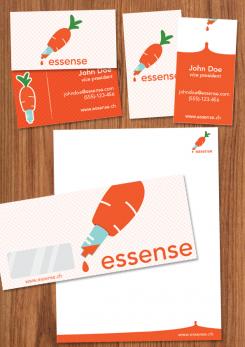
Stationery design.
Think BOLD :D
Logo and Design for Catering Company
- Titulaire du concours: mvirmond
- Categorie: Logo et Identité
- Statut: Terminé
Date de lancement: 02-10-2012
Date de clôture: 12-10-2012
Tout a commencé par une idée...
Un guide court et interactif les a aidés à découvrir leur style de design et a parfaitement saisi ce dont ils avaient besoin.
Brandsupply est une plateforme où des professionnels créatifs et des entreprises collaborent sur des projets et des designs uniques.
Les clients à la recherche, par exemple, d’un nouveau logo ou d’une identité visuelle décrivent leurs besoins. Ensuite, les designers peuvent participer au projet via Brandsupply en soumettant une ou plusieurs propositions. Le client choisit finalement le design qu’il préfère.
Les coûts varient selon le type de projet — à partir de 169 € pour un nom d’entreprise ou de projet, jusqu’à 539 € pour un site internet complet. Le client décide lui-même du montant qu’il souhaite investir pour l’ensemble du projet.
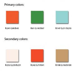
Color scheme
aucun commentaires
I like it!
i like it too - it's fun
i need to think about it for a bit though
If you'd like I could whip up some templates(business cards and what have you)
I'd be happy to look at them. This design is still a bit out there - very different from all the other designs. For me, it hasn't made the final selection (yet), but it's pretty close. Feel free to play around with the logo and come up with the templates if you don't mind. I imagine that could bring it to life even more
Hey there.
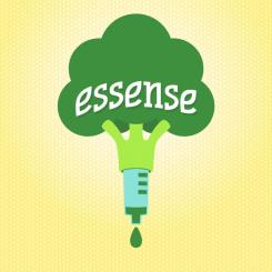
I thought about your comments and your new input on the whole competition and I give you these two top of the line, all natural, farm fresh, custom logos.
Enjoy!
Again, feedback will be much appreciated.
fun as well, but i'm not sure people get it as quickly as the carrot-version
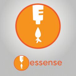
Hey there!
I particularly enjoyed the witty name, so I made this design.
Being that you serve salads, healthy food and such and your name is in fact "essence", so why not make a clever/witty logo?
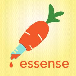
The simplified image of a pipette dripping a droplet of fresh food should do the trick.
The colors were specifically chosen to work up an appetite, usually companies dealing with food use warm colors in their branding(think McDonald's, Burger King, Pizza Hut etc.)
The logo is circular, as in it is whole, complete and friendly at the same time.
Because of the logo's simplicity it can be used in a myriad of ways: from embroidered hats to mugs, pens, calling cards, you name it. Basically, a brand can easily be built around it.
I hope you like it, feedback will be much appreciated.
thanks for the design and extensive explanation!
Not a bad idea at all. i like the colors - less obvious than green, but exactly as you say, still fresh and appetizing. to be frank, I didn't immediately recognize the symbols. I saw an upside down carrot, and some tool or the letter E on top. maybe you can play around with the idea a bit?
 Nederland
 België
 Deutschland
 Österreich
 United Kingdom
 International